15 McMansion Design Mistakes to Avoid in Your New Home Build
When you’re building your own house, the easiest way to go wrong is trying to do everything at once—mixing styles, stacking rooflines, and sprinkling “wow” moments that don’t add up to a single idea.
From the street, that overreach reads as noise: a garage that steals the view, patchwork materials with no clear hierarchy, and roof seams everywhere. Inside, it shows up as echoing foyers, great rooms that don’t actually seat people well, afternoon glare that keeps shades down, and baths heavy on stone but light on storage.
Use this guide as a simple filter for every decision: keep massing and roof geometry calm, set a consistent window rhythm based on how each room is used, choose climate-smart materials detailed to shed water, and put budget into the envelope and systems that deliver comfort and quiet. Run the 15 checks below while you’re still on paper and your home will feel settled on day one—and still read right a decade from now.
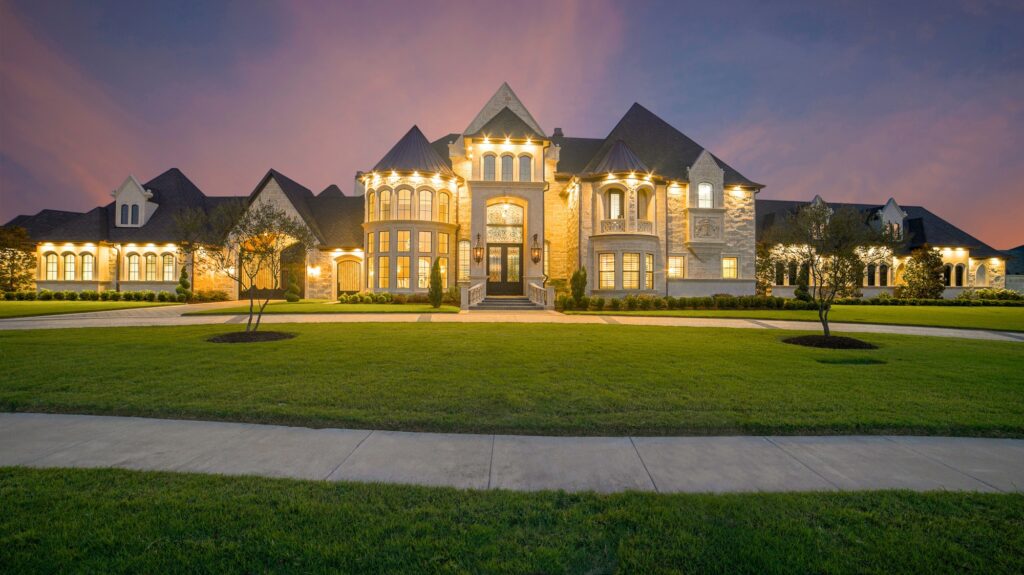
1) Gable-Salad Rooflines and Fussy Massing
Spiky silhouettes stacked with cross-gables, shedlets, and orphan dormers create visual noise and construction complexity. Every roof-to-wall intersection is a future leak risk, every valley a debris trap, and every pitch change a labor premium. Busy massing also dates quickly; today’s flourish becomes tomorrow’s maintenance headache.
Pare the forms early. Compose one or two primary roof planes with consistent pitch and align secondary volumes cleanly beneath. Where you want character, use a single well-proportioned gable, a modest shed bump-out, or a clerestory that brings light deep into the plan. Simple roof geometry lets you spend on better underlayments, ice-dam protection, and clean edge metal—details buyers can’t see but inspectors (and long winters) will respect.
2) Garage-Forward Facades That Dominate the Street
A wide triple garage slapped across the front reads like a parking lot with a house attached. Doors become the “face,” entry sequence gets lost, and curb appeal suffers no matter how many coach lights you add. On narrow lots, this “snout” effect can be hard to avoid unless you plan intentionally.
Pull attention to the front door, not the overhead doors. Tuck garages side-load where possible, step them back from the primary facade, or break the mass with a carriage-style single plus tandem bay inside. Upgrade the pedestrian experience: a clear walk, generous front stoop, and warm 2700–3000K lighting at eye level. A garage that supports daily life without upstaging the house is a quiet value booster.
3) Fake Shutters, Stick-On Stone, and Foam Trim
Applied décor that doesn’t match function signals pretense. Shutters narrower than the glass they “cover,” stone veneer pasted in random patches, and oversized foam crown outside all age poorly. Water finds the weak points, UV chalks the coatings, and resale photos telegraph “shortcut.”
Choose honest materials sized and installed correctly. If you love shutters, spec operable pairs with proper hinges and dogs, sized to the window. If you want stone, wrap it logically around volumes or use it as a plinth to ground the massing, with real flashing and weeps. For trim, favor fiber-cement, PVC, or well-detailed wood in profiles that complement the architecture. Restraint with a few crisp moves beats a collage of appliqués.
4) Window Chaos: Bad Proportions, Misaligned Grids, and Random Sizes
Mismatched muntin patterns, inconsistent head heights, and windows scattered without relationship to rooms create visual fatigue outside and awkward light inside. The eye wants rhythm; the plan wants daylight where tasks happen.
Set a fenestration language: consistent head heights (e.g., 7′-6″ or 8′-0″), coordinated sill heights by room type, and limited muntin patterns that match the home’s style. Group windows to make luminous walls in living areas and use tall, narrow units to pull light deep along corridors. Align openings to interiors—sink windows at the right height, study windows that side-light screens, bedroom windows that keep privacy while framing sky. Coherence outside comes from intention inside.
5) Two-Story Foyers Without Thermal or Acoustic Strategy
Grand foyers impress in photos but often echo like gymnasiums, leak conditioned air, and eat square footage that could serve storage or a quiet office. The drama fades fast when the thermostat spikes and voice calls bounce around.
If a volume entry is on your wish list, integrate acoustic control (textiles, slatted wood, soft furnishings) and ensure the envelope at the lid is airtight and well-insulated. Add a transom or clerestory that genuinely daylight the stair rather than an oversized void for void’s sake. Otherwise, scale the foyer to human proportions, spend on a beautiful door system, and channel “wow” into millwork, lighting, and sightlines that lead to a framed view.
6) Columns, Arches, and Mixed Eras Without a Story
Tuscan columns on a Craftsman porch, Gothic arches abutting Prairie windows—style mash-ups without logic feel theatrical. They also push you into custom trim and fussy transitions that bleed budget.
Pick a coherent vocabulary and stay faithful. If you love classical cues, size columns to the span and beam load (even if aesthetic), keep entasis subtle, and let details repeat at a consistent scale. If you favor modern, commit to clean reveals, slim profiles, and a tight joints story. Fewer, better details will look considered rather than themed.
7) Dormers That Don’t Daylight or Vent Anything
Sticker dormers glued to the roof for “character” add penetrations without function. They complicate flashing and age into leak suspects, especially when they die into valleys or foam stucco returns.
When you add a dormer, give it a job: genuine daylight, usable headroom, or cross-ventilation. Keep side walls tall enough to finish cleanly, spec real roof windows where appropriate, and integrate the dormer into the framing plan rather than dropping it onto roof sheathing later. If the roof wants to stay simple, let it—beauty often arrives through restraint and a good eave detail.
8) Echo-Prone Great Rooms With Furniture That Floats in Space
Vast rooms without acoustic or lighting strategy look impressive but feel cold. Seating floats too far from walls, lamps have nowhere to plug in, and TV locations duke it out with windows and fireplaces. Family life gravitates back to smaller nooks.
Design the great room from a furniture plan. Define conversation zones with rugs, built-ins, and lighting layers on dimmers. Provide floor outlets where seating floats and locate a believable TV wall that doesn’t fight glare. Treat hard surfaces with area rugs and soft textures, or consider a ceiling slat or panel moment to soften reflections. A room that contains sound and supports tasks is luxurious to live in.
9) Maze-Like Circulation and Angled Walls for “Interest”
Angles introduced without a plan chew up square footage and create dead corners that are hard to furnish. Long corridors lined with doors feel like a hotel, not a home, and add cost without utility.
Aim for short, direct paths and rectangular rooms that furnish easily. Where you want variety, use ceiling height changes, built-in niches, or framed views rather than arbitrary diagonals. Keep stairs straight or gently turning; save switchback gymnastics for tight sites that truly need them. You’ll gain both usable area and calm.
10) Kitchens Built for Photos, Not Cooking
Island monoliths that pinch aisles, range flanked by no landing space, giant fridges stuffing narrow work triangles—these choices look flashy and cook poorly. Cleanup zones collide with prep zones, and two people can’t work without elbow wars.
Start with workflows: two legitimate prep stations (each with knife storage, trash, and task light), 42–48″ aisles, and clear landing areas on both sides of the range and near the fridge. Consider a modest scullery with a second sink or a drawer dishwasher to handle holidays. Ventilation matters more than appliance flex; plan make-up air where required and duct routes before cabinet drawings freeze. A visually quiet kitchen that functions at speed will age gracefully.
11) Monumental Primary Baths With Corner Tubs and No Storage
Cavernous baths anchored by corner tubs and tiny showers look impressive until you live there. The tub gathers dust, the shower feels mean, and there’s nowhere for towels or hampers. Moisture lingers without robust ventilation.
Right-size bathrooms with curbless showers, niches sized to real bottles, and a bench that fits a human, not a figurine. If a tub matters, pick one comfortable for soaking and place it with natural light—not jammed kitty-corner. Add ventilation with quiet, timer-controlled fans and an ERV/HRV strategy for the whole house. Build storage walls: tall linen cabinets and drawers sized for daily items. Utility wrapped in calm materials reads high-end without waste.
12) Finish Overload: Four Countertops, Three Tiles, and Two Hundred Lights
Throwing every material you love at one build creates visual chatter and higher maintenance. Trendy surface combos age fast, and inconsistent color temperature across lighting makes even good finishes look off.
Disciplined palettes win. Select one hero material per zone—perhaps a beautiful quartzite at the island or a porcelain slab in the shower—then support it with quiet companions. Keep lighting to high-CRI sources in the same temperature range and layer ambient/task/accent with dimming. Standardize hardware finishes where sightlines connect. Editing is free and powerful; it also simplifies procurement and cuts waste.
13) West-Facing Walls of Glass Without Shade
A broad west facade with unshaded glass creates afternoon glare and overheating that blinds TV watching and spikes HVAC run time. Owners respond by living behind closed blackout shades, defeating the whole idea.
Use orientation-aware glazing and exterior shading. On west and east, lower SHGC glass helps, but shadows matter more: awnings, vertical fins, deciduous planting, or a porch canopy sized for latitude. Inside, plan sheer + blackout roller shades recessed in simple pockets. Put your biggest glass where it will shine—often south and north—and treat west as a view with a plan, not an all-glass wall.
14) Fake Symmetry and Misaligned Centerlines
Pendants that don’t align with sinks, front doors that miss the axis of the hall, windows off-center from the room—these small misses add up. The house feels almost right, which is often worse than clearly asymmetric by design.
Draw centerlines on plans and elevations and respect them. Center fixtures to functional anchors: sinks, islands, fireplace openings, and bed walls. When asymmetry serves the plan, make it confident—balance weight with shelving, art, or window pairs that clearly land somewhere intentional. Precision costs nothing in materials and everything in perceived quality.
15) Big But Cheap: Skimping on the Envelope and Systems
Pouring budget into square footage while scrimping on air sealing, insulation, windows, and HVAC leaves a house that looks rich and feels drafty. Utility bills climb, comfort wobbles, and inspection reports flag the mismatch.
Spend on the shell and mechanicals first. Demand a continuous air barrier with a verified blower-door result, right-size insulation (including exterior continuous where climate warrants), and climate-appropriate window U-factors/SHGC. Choose variable-speed HVAC with balanced ERV/HRV ventilation and low-sone bath fans. These choices outlast fashion and show up every day in comfort, quiet, and resale confidence.
Bonus: Landscaping as a Last-Minute Costume
Rushed plantings that hug foundations with too-close shrubs, a patchwork of mulches, and no drainage strategy make even a good house feel temporary. Overgrown beds quickly hide siding, trap moisture, and invite pests.
Let the site plan lead. Grade for positive drainage, define beds with consistent edging, and pick a restrained plant palette with evergreen structure and seasonal interest. Size the front walk generously, set house numbers and entry lighting with care, and run sleeves under hardscape for future utilities. Landscaping that looks inevitable elevates the architecture rather than hiding it.
How to Bake “Timeless” Into Your Build (Practical Guardrails)
Create a one-page design brief that ranks priorities: proportion, light, envelope quality, storage, sound, and maintenance. Use it to test every choice. Standardize head heights and hardware finishes, align openings, and keep roof forms clean. Concentrate budget on the first things—siting, shell, windows, HVAC, and millwork that supports daily life. Add personality in replaceable layers: lighting, paint, mirrors, and textiles.
Run pricing checkpoints at Schematic and Design Development so ambitions match allowances. Build mockups of one window bay, one tile corner, one cabinet run; lock details before replicating them a hundred times. Finally, document the invisible work—flashing stacks, insulation, duct sealing—so quality has proof when you sell.
Quick Owner-Builder Checklist
- Compose simple roof forms with consistent pitch; avoid gratuitous cross-gables
- De-emphasize garages; design a welcoming front entry and clear arrival
- Use authentic materials and right-sized details; skip stick-on décor
- Set a fenestration rhythm: consistent heads/sills, limited muntin patterns
- Scale foyers humanely or plan volume with acoustics and airtight lids
- Pick one architectural vocabulary and repeat it with discipline
- Add functional dormers only; integrate with structure and flashing
- Lay out great rooms from a furniture plan; add floor outlets and layered light
- Keep circulation short and orthogonal; avoid arbitrary angles
- Design kitchens around workflow and ventilation, not just appliances
- Right-size baths for showers, storage, and quiet ventilation
- Edit the finish palette; standardize lighting color temperature
- Shade west/east glazing; put big glass where light is easiest to live with
- Align centerlines; center fixtures to real anchors
- Prioritize the envelope/HVAC; verify air sealing, insulation, and comfort
The Bottom Line
Homes feel timeless when proportion, light, and build quality lead, and when style is expressed through a few disciplined moves instead of a grab bag of features. Keep the roof calm, the facade honest, and the plan organized around real life. Spend where comfort and durability live, and let your personality ride on layers you can refresh later. That approach dodges the McMansion trap entirely, delivering a house that welcomes you today and impresses the next owner—without apology and without drama.

